
LinkedIn posts have invite links to other mentorship platforms, driving engagement away from LinkedIn which results in mentors and mentees connecting there, reducing LinkedIn's activity.
This move will enhance LinkedIn's social value by boosting user engagement, retention, and overall activity, solidifying its position as the leading professional network.
All in all, this seemed like a practical thing to do, if it makes sense for the users and the business, why not try to build it?
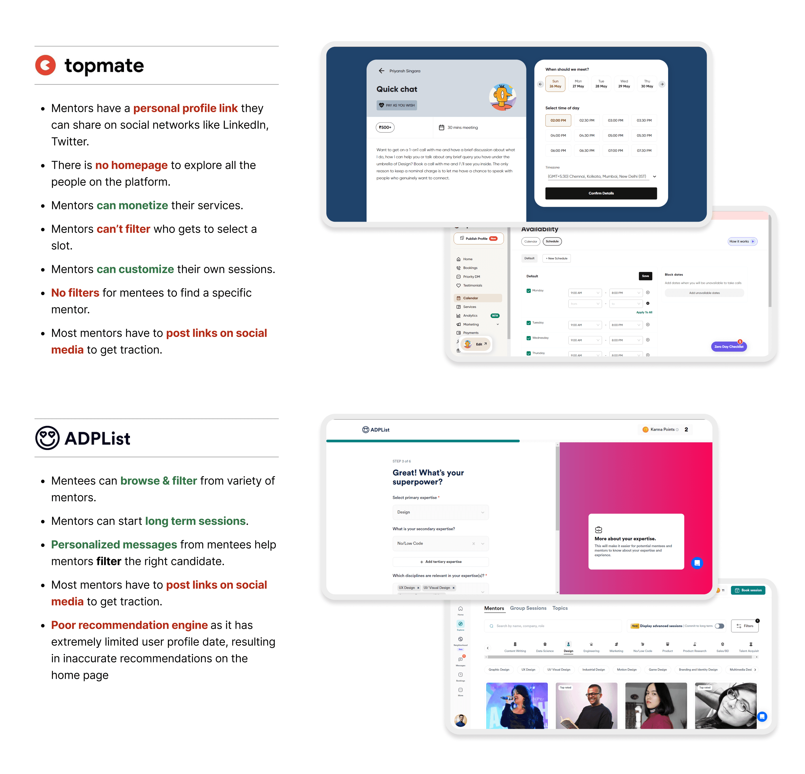
❋ analysing topmate & adplist ❋
To better define user needs, the next step was to create user stories, which would serve as a basis for the solution's goals.
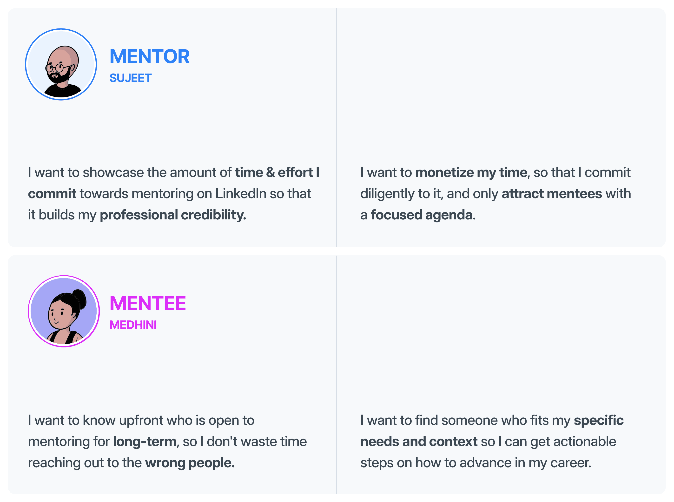
❋ user stories ❋
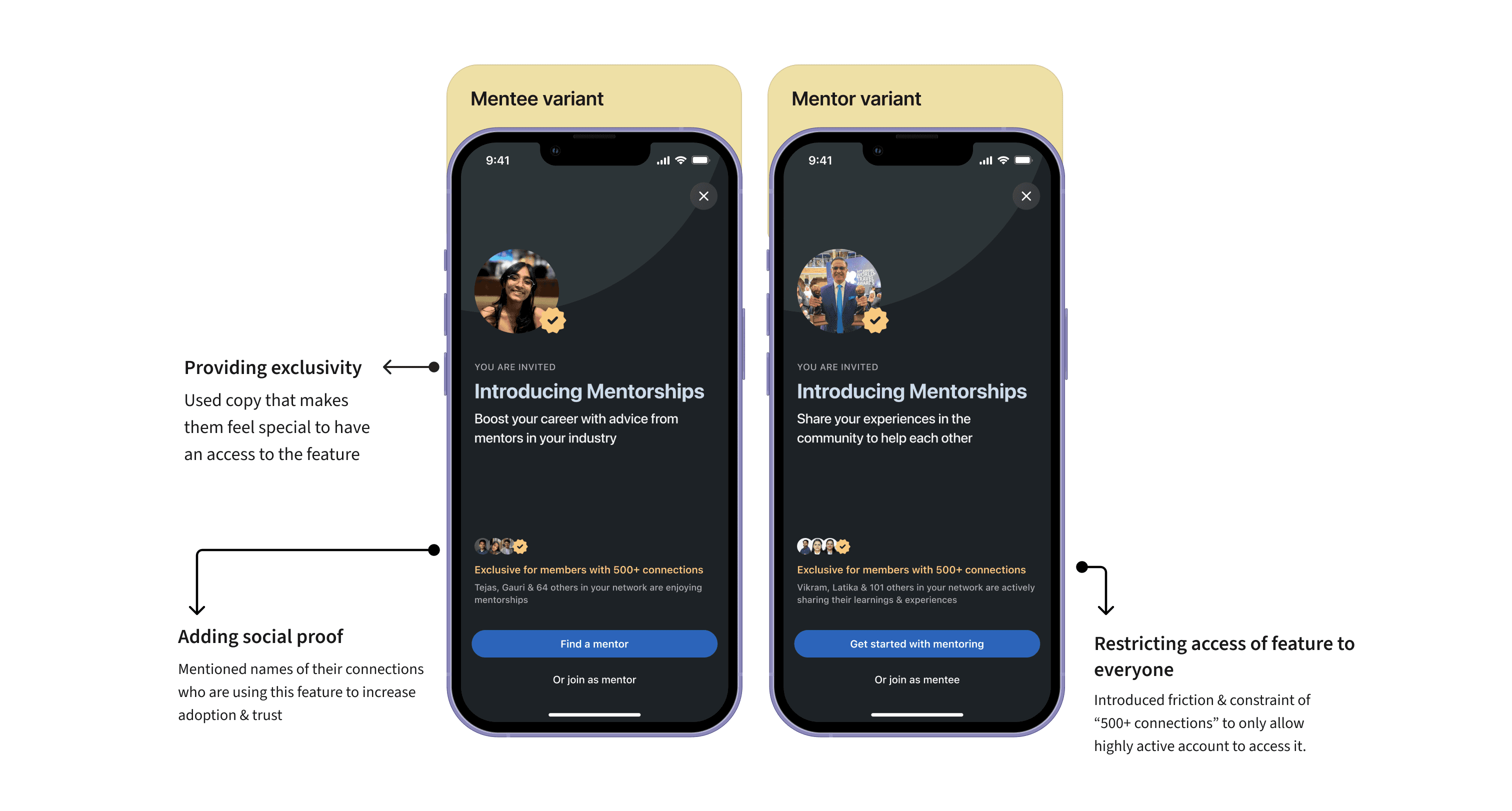
❋ full overlay sheet for discovery ❋
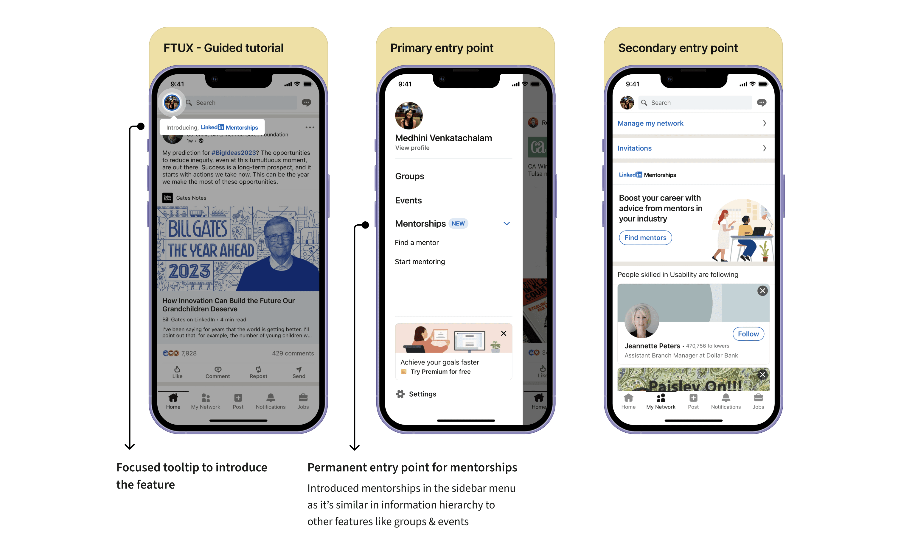
❋ feature entry point ❋
Mentor card
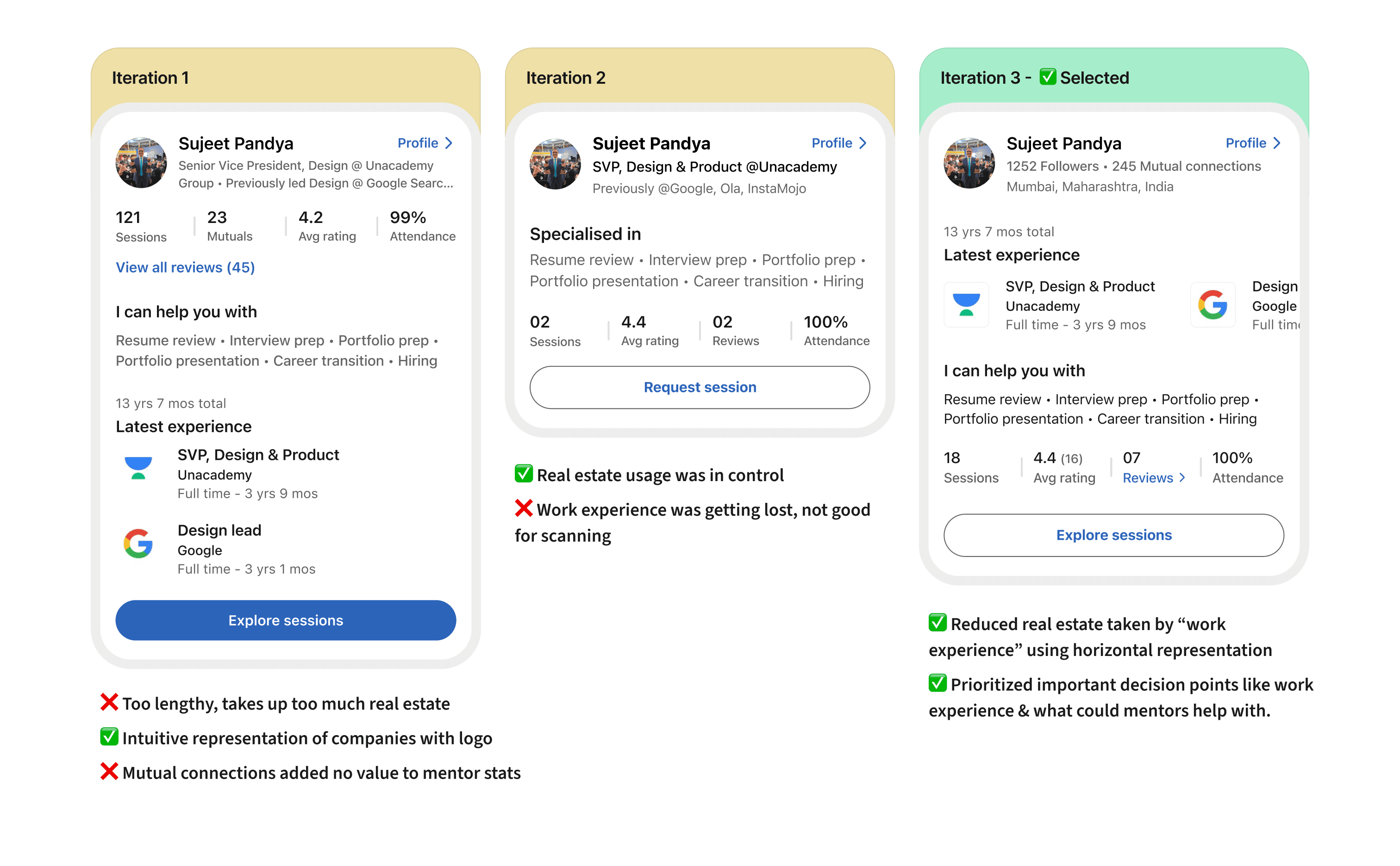
Most users on other mentorship platforms check the mentor's LinkedIn profile separately to know more about them.
To solve this pain point, I added important profile details, like work experience, upfront. Balancing all of this information in limited space was tough.
What the mentor can help with
Their work experience
Mentor stats
❋ finer details of "mentor card" ❋
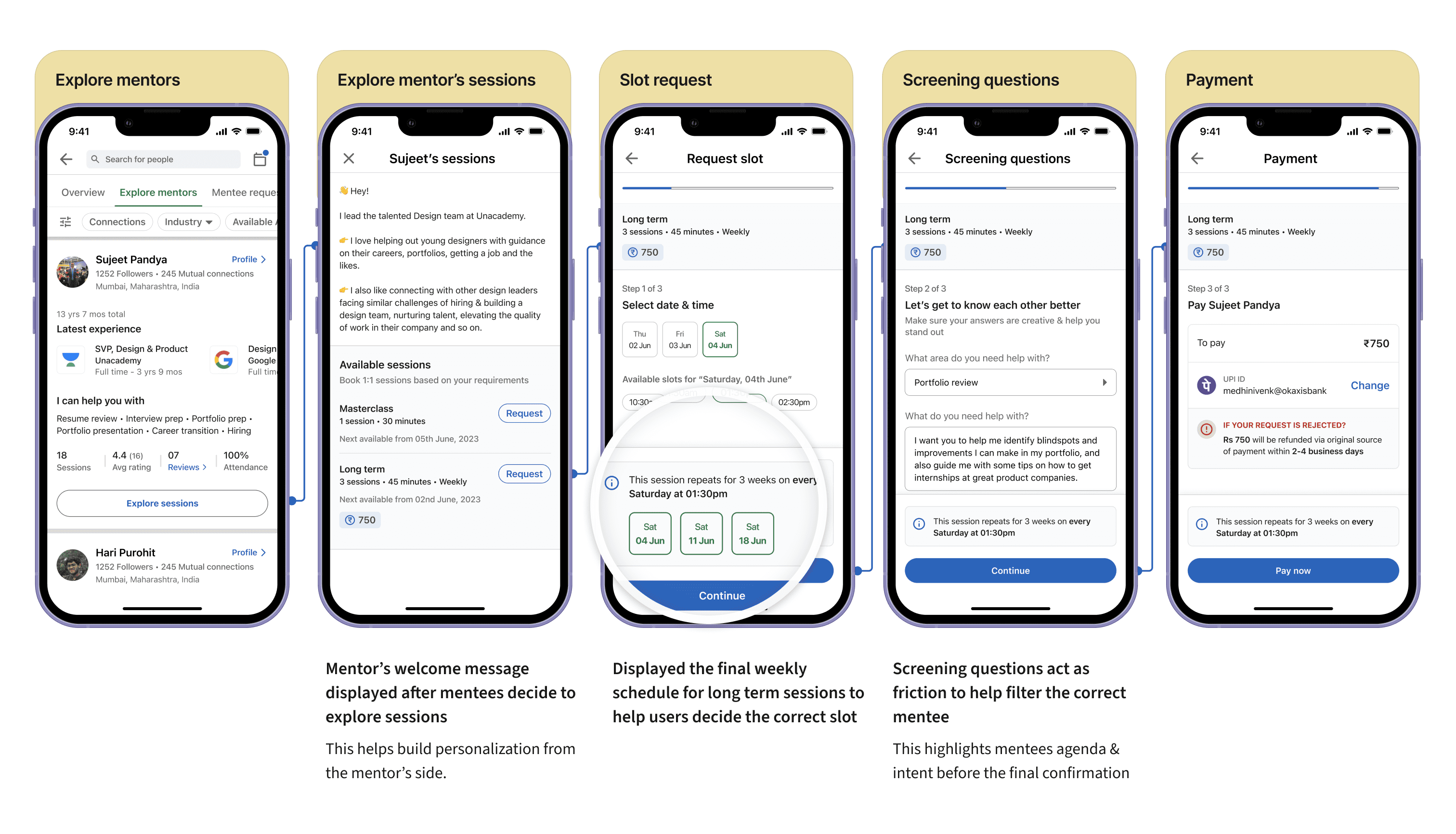
While everyone in this world prefers a simple way of booking a slot, I introduced friction through screening questions, agenda selection, and paying beforehand.
Conventionally, people never pay beforehand, but why do it here? I considered demanding payment while requesting as this intentional friction would encourage mentees to choose sessions wisely.
❋ finding a mentor flow ❋
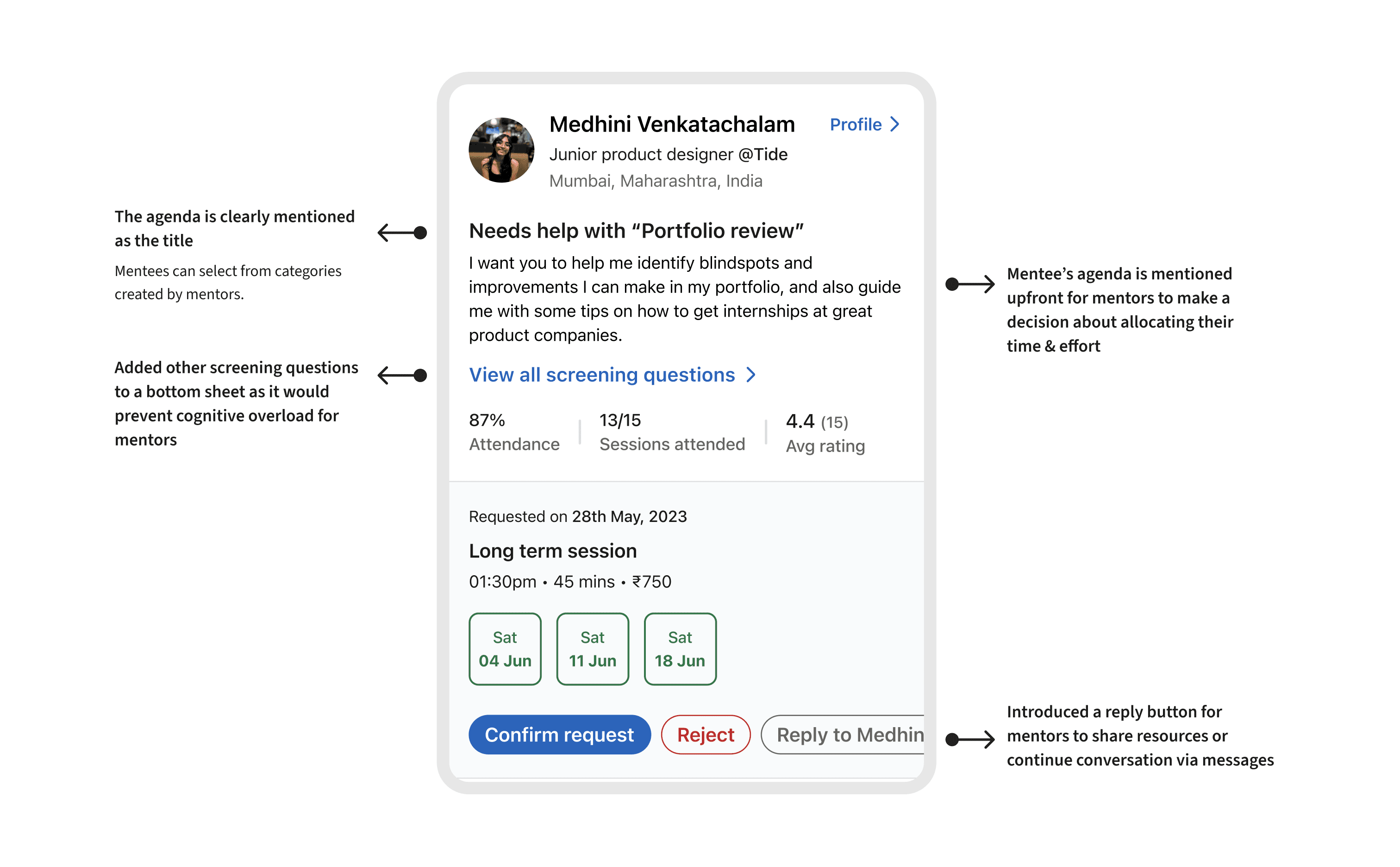
The request card should resemble the mentor profile card but focus on different decision points for mentors to choose the right mentee.
Screening questions with agenda
Work experience
Session details, including date and time
Mentee stats, like attendance and reviews
Let’s have a look at how this information can be represented -
❋ finer details of "mentee request card" ❋
The flow where mentors accept requests from mentees
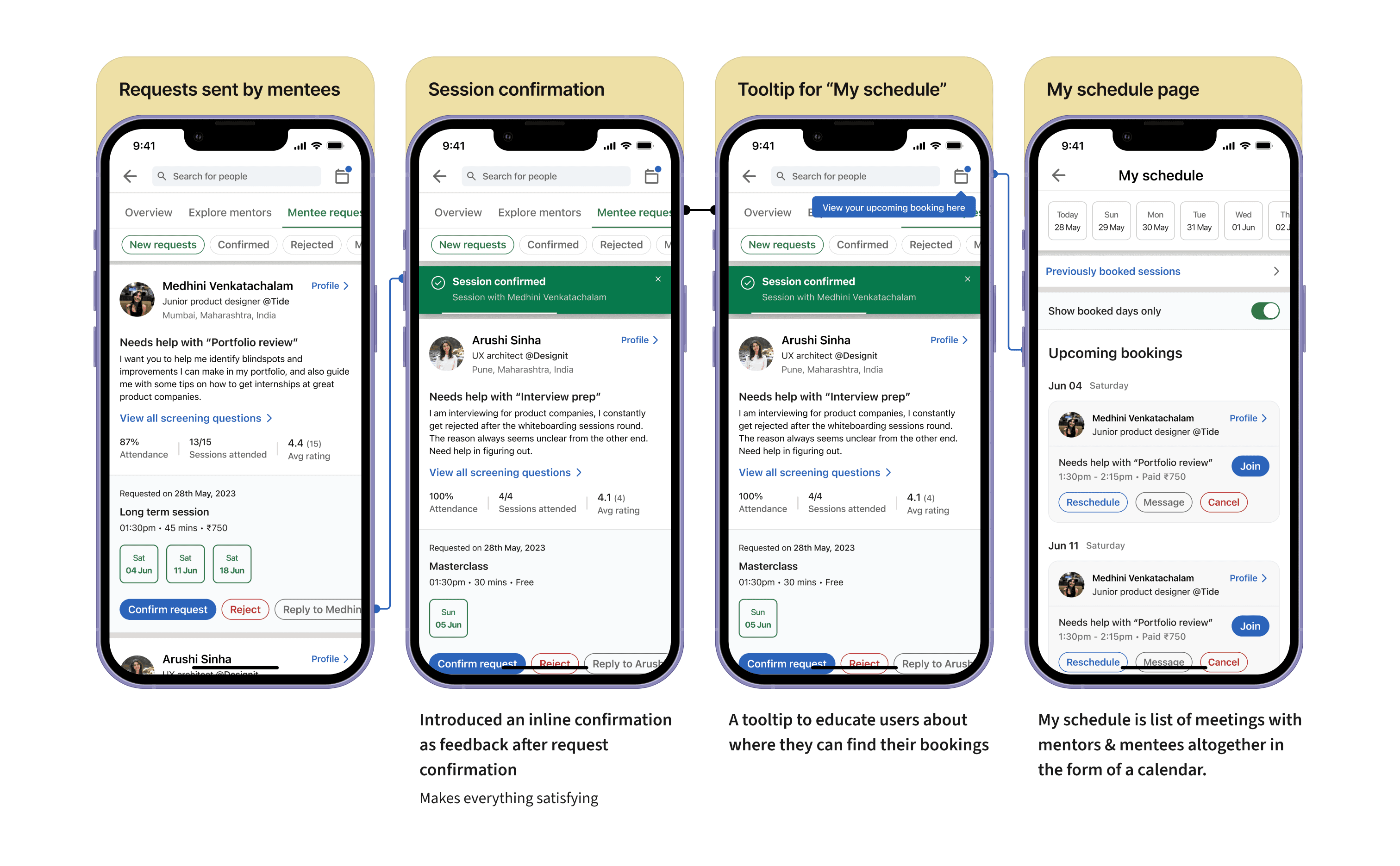
❋ ACCEPTING REQUEST FROM MENTEE FLOW ❋
While designing the feature's navigation, it was clear that an overview page was needed to allow users to manage their preferences and see everything at a glance.
Key goals for the overview page included:
Providing entry points to start mentoring or be mentored
Showing monetization details upfront with options to connect payouts
Allowing easy access to edit their services
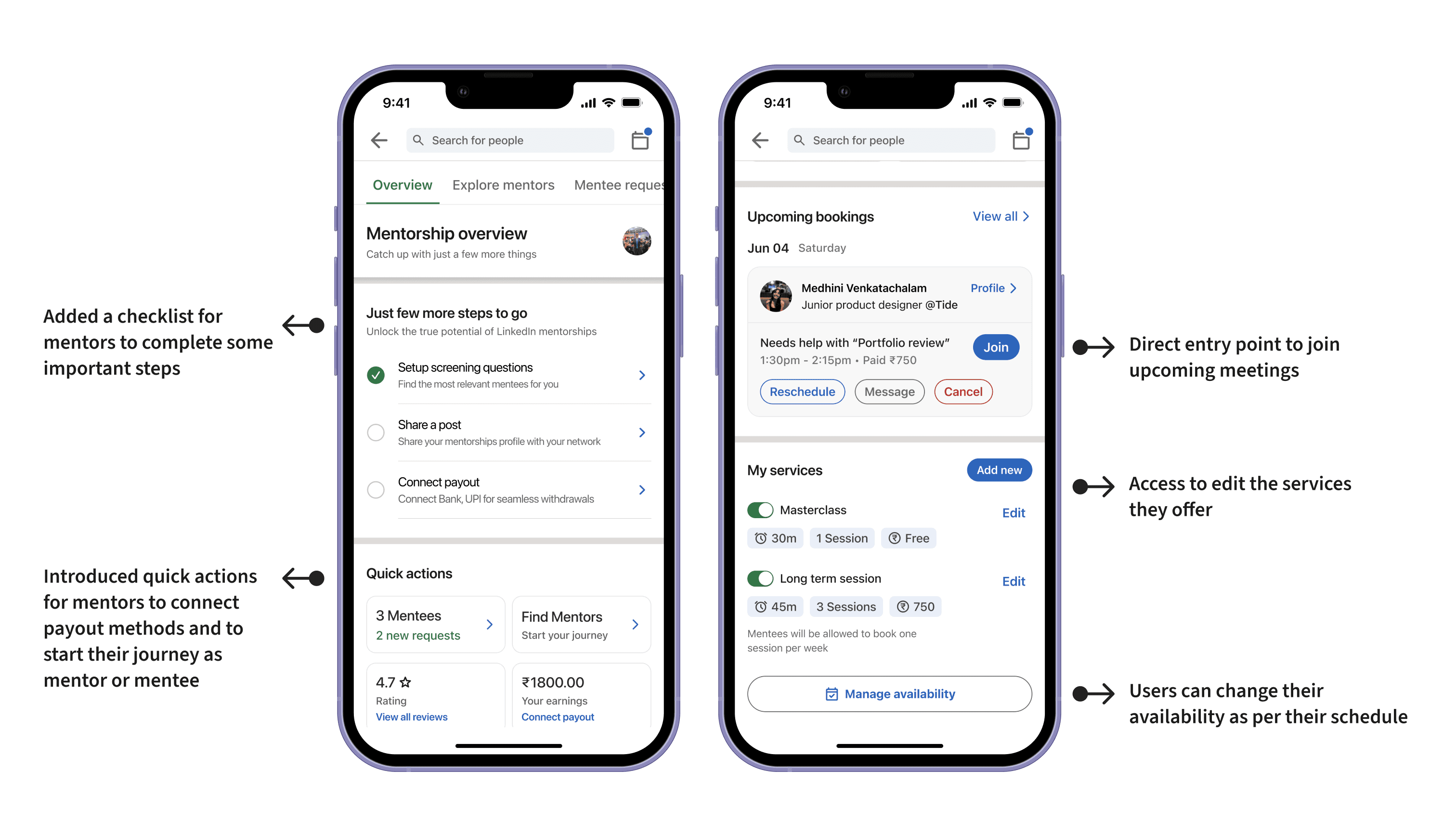
❋ OVERVIEW PAGE ❋
A major pitfall of the Mentorships feature was its hidden placement in the sidebar menu, making it difficult for users to stay updated.
Integrating it into the main ecosystem was crucial so that users never forget about the recent activity related to mentorships. This led to the notifications tab integration.
One core insight from mentors was their desire to showcase the time and effort they commit to mentorship to build their professional credibility.
To act on this, I decided to add mentorship stats to user profiles, highlighting the time and effort they invest.
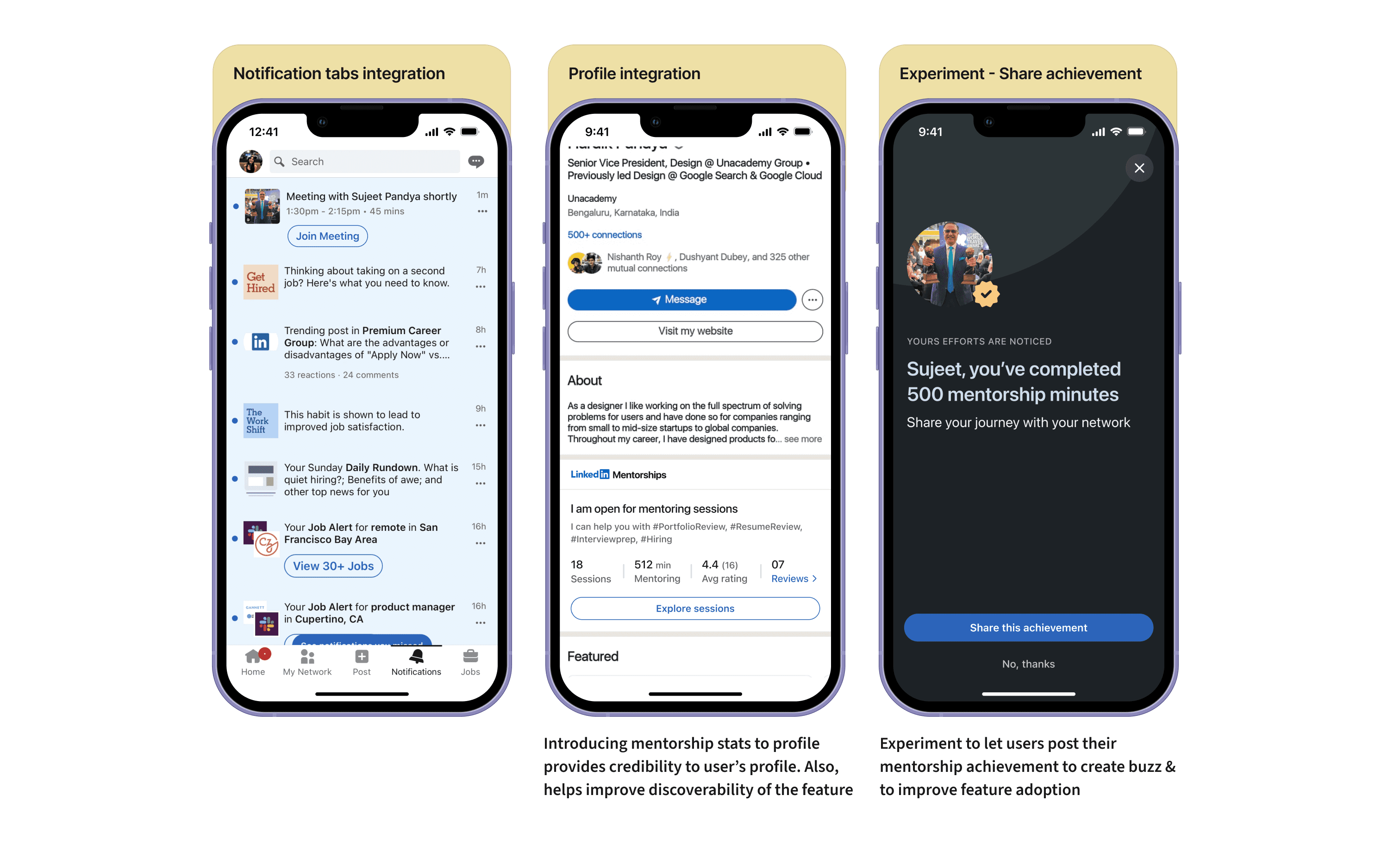
❋ ECOSYSTEM INTEGRATION ❋
Mentor-Mentee ratio - I would keep the ratio of mentor-mentee in check, keeping the ecosystem fueling from both sides.
Number of sessions booked per month
Onboarding completion - Since it's a fresh feature, I would track how many users are discovering the feature and onboarding on it.
Churn rate - Since mentorships are a long-term game, users should use this feature for a long time to drive the most value.
Always consider the business aspect and how a feature drives the core metric of a product.
How does one carry forward an existing design system and language? Everything from analyzing components, finding some inconsistencies, and whatnot.
Ensure the new feature integrates seamlessly into the existing ecosystem, and how it has various little details to consider like touchpoints, scalability & more.
If you’re still here, then I know you have found something interesting, or everything interesting maybe✨
I am looking for internships, let's talk about design & products.


